CE Ultrawide, Aspect Ratios and Photography
I understand cinema and projectors often use different aspect ratios than the ones commonly used for average living room TVs. The rule of the thumbs the hobbyists seem to go by is go with the contents’ ratio you watch on your screen. Reasonable enough. Then what is the aspect ratio of a modern website? What is the guideline for us?
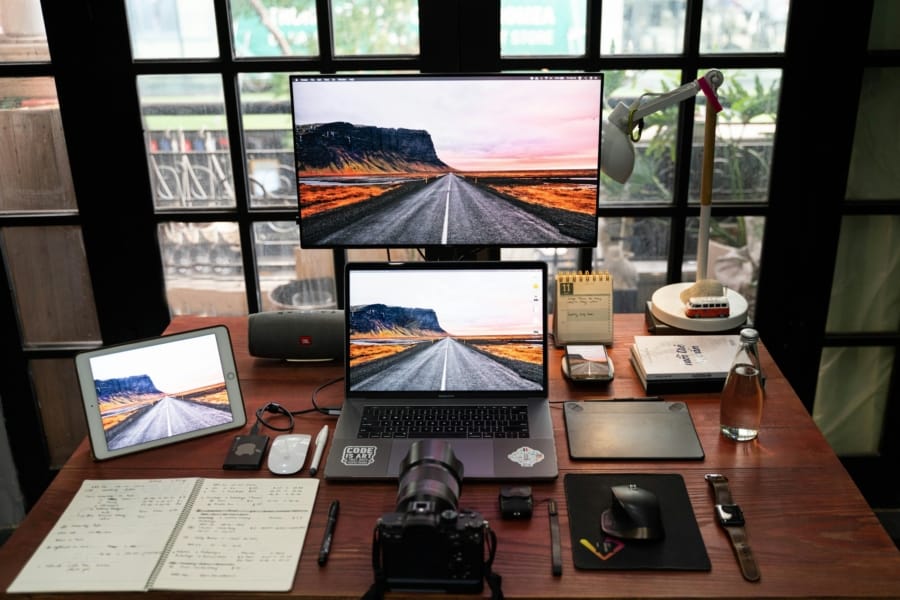
Most, if not all, featured images are related images found on stock footage sites. Currently I am using Unsplash, —shoutout to creators who contribute to the platform as well— and a lot of the images on the platform and possibly the other stock footage platforms as well are in 4:3. I was surprised to learn that not only the most popular aspect ratio in digital photography is still 4:3, most creators are willing to stick to the original aspect ratio from the camera, instead of altering it. This may as well be the nature of the stock image sites, not the actual photography industry. I wouldn’t know the origin of the story.
Until recently, I either cropped the stock images manually or uploaded them as-is to use in the Mad Tea Party. 4:3 images or anything vertical simply take up too much screen space with the current way the posts are curated on the front page. Then it dawned on me: a. I’m allowed to crop stock images, but I would prefer it if I could preserve the original while altering it to fit my usage, b. stock footages often have wide focal points and can take some beating. My pet project to automate the whole process in PHP took me much longer than it should have. Because with the magic of CSS, proven and efficient, now the website is automatically hiding —much like letter boxes— an image to make it 16:9, assuming it was longer vertically.
I will be sharing a how-to on the method soon. It’s quite simple, and I hope more people don’t end up in a rabbit hole like I did, trying to do the same thing DIY. And frankly, I believe the question still remains. I’m happy with the way the featured images are displayed: half image, half text. But I’m talking about 16:9 computer monitors and bar type smartphones. In the near future, we might be welcoming “21:9” as the most common display aspect ratio. What will I do then? Will I be bringing back the good ol’ divider in the middle? What will become of featured images? Will I be cropping it from 4:3 to 21:9? (note: foldable smartphones only take up 1.5% of global smartphone market. Not only it’s a minority form factor, each foldable has different aspect ratio.)

Comments